 |
| all images via Haute Design.com or Haute Design's Facebook page |
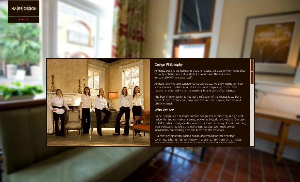
You already know I'm a low-country gal at heart. That means I've got a bias for designers, style, and architecture from that area. There is a design company that embodies that style that I want to introduce you to. Readers, meet
Haute Design of Charleston, SC.
Haute Design, meet my readers!
This group of gals has it together! Remember me trying to decide how to describe my decorating style? I called myself a "design mutt" but the truth is it's low-country style. It combines a lot of organic, traditional, contemporary, and transitional into one. I think if you take a look at these pictures you'll see what I mean. Most of it is me to a "T"! I love these rooms with all their organic texture, marsh colors, and mix of traditional and transitional styles. This is where my house is headed, albeit a little slow. It will happen in stages as money allows. I'll show the process as I go along.
Ready to get inspired to add a little "Low-Country" style to your home? Let's see what makes up this so-called style I love:
 |
| Loving that console table, heart -pine floors(?), heavy wooden doors and millwork! |
I love this foyer. The contrast of the rough natural console with the polished millwork, the lantern, contrasting heavy wood door with smooth white trim, black and gold shades again on that rough console. Genius! It keeps your eyes moving and engages you to your surroundings. True study in contrasts.
 |
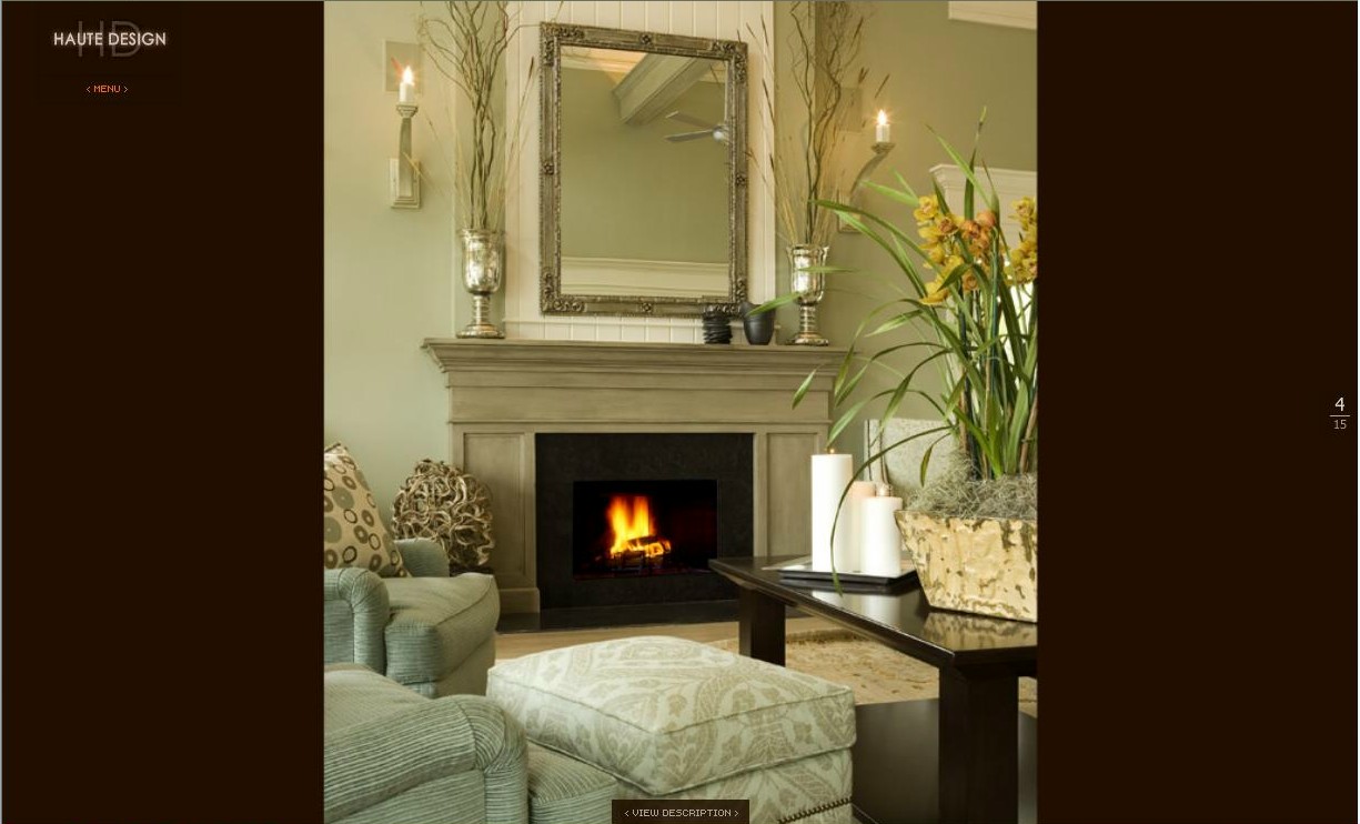
| Traditional yet contemporary and cozy. |
This room is more formal, but the sofa is still soft looking - not stiff which contrast nicely with the hard lines of the coffee table. Again, notice color. There's wood, antique gold, little doses of black, sisal, wool, and metal! Great combination of everything.
Notice the softness of the chairs and ottoman (prop your feet up, please!) contrasting with the angular lines of the black coffee table and mantle. Little touches of driftwood sculpture, willow and grass and...as always color.
This vanity is great! I love the turned legs and soft gray. I'm not a huge fan of those sconces, but I know they and the stainless sink were chosen to provide some contrast to the more traditional lines of the vanity. The wallpaper reminds me of palm frawns (another coastal element) and there's the grass again on the sink.
 |
| Color is what pulls this room together and says "low-country". |
I love this for a formal room. It still feels like you could curl up with a good read and a cup of coffee during the hot afternoons, but could entertain more formally in style. That wonderful soft cream on the walls, the very muted golds and gray/blue with little doses of black. The area rug picks up the colors and ties it all together. And then....there's the star...that ever popular Italian chandelier! If money were no object and I could afford to be trendy, this is a piece I would buy in a heartbeat for my dining room.
 |
| Gorgeous! |
Notice the use of dark brown to ground all the lighter colors, planked walls, french ladder back dining chairs, hardwood floors and door, matchstick blinds, and ...you guessed it...watery, earthy colors. This is shockingly similar to my family room currently (although they obviously had an "existent" budget to buy accessories and furniture compared to yours truly!). What is so funny is that I've just discovered this design group and these images. This room is much prettier, but mine is getting there. As pretty as it is, my room would have a little more white and a little less dark furniture. I think it's the use of the accent and coffee table, dining table AND sideboard that makes it just a little too much for me.
 |
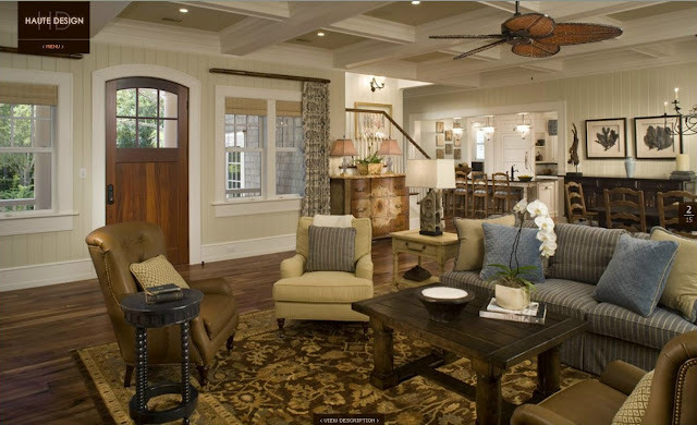
| This is me to a T! |
I'm just in love with this room! The coffered ceilings painted a faint blue between creamy white millwork, all the colors, the fabric on the curtains, beautiful rug, ceiling fan, comfortable furniture, natural woods, etc! I honestly don't see a thing I don't like here. This is where I want to take my family room...just a little lighter, brighter and softer than the previous.
 |
| Ditto. Is this room not just perfect?! |
 |
| Those curtains, table and chandelier....! |
How awesome is that table? This is more my speed...casual bomb shelter style...indestructible with kids! The more nicks and scapes, the better the patina:) Notice the sisal rug...another low country staple, along with sea grass, which is my personal favorite.
 |
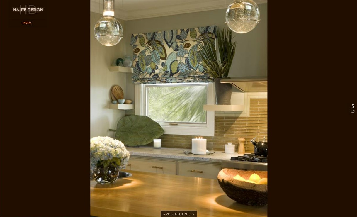
| General direction my kitchen is headed. Great pendants over the island. |
Great white cabinets (not in any way related to the shark! Sorry...it's just what came to mind:) and oil rubbed bronze harware with cup pulls. I think I may have the same style in my kitchen (except mine probably cost a fraction of these!). My cabinets are going creamy white like this as soon as I can get a paint sprayer.
 |
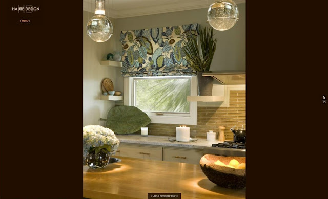
| Color, floor and lighting. |
 |
| I'd swear that was "Brittany Blue" by Benjamin Moore on the walls. |
Again, just a little freaky how similar this is to my master bedroom! I think it's even the same color (and again...nicer). If my room was neat and staged, I'd go take a picture and share it so you can see for yourself. They aren't identical, but the use of white, soft blue, and dark wood bed is uncanny in similarity. Our master bedroom is my favorite room in my house. I'll share it soon. It's also my work space inside, so it's hard to keep tidy:)
 |
| Looking a little like my stick mirror?! Great organic texture. |
 |
| Little more modern than the others. That fabric and those pendents are great. Talk about a conversation piece! |
 |
| Boarded walls and headboard, vases, frame, night stand... texture galore! |
 |
| Looking a little nautical. LOVE those five panel doors, door knobs, hinges, bed and trim work. I would love to do something similar in one of my boys rooms. |
 |
| Not quite my style, but the colors are dead on. |
 |
| Notice louvered doors and pine floors. |
 |
| This is more my style. Notice the wrapped pulls, counter top, mirror frame, and sconces. |
I'm sure there were budget restraints here and homeowner wants, but although I appreciate the cleanness of the white tile, I can't help but think something with a little more sand color/texture would have enhanced the room. Hardwood floors would be the icing on the cake, but this is probably a kid/guest bathroom meaning it could be REALLY impractical (have you ever seen what boys can do to a bathroom?)!
You'll notice there are several common elements running through all these pictures...color being the most obvious. The colors stay within the soft natural palette of watery blues, greens, taupes, creams and soft golds. It's a relaxing palette. You'll also notice there is very little of the typical "sea-side" nautical themed accessories. It's all communicated in color and texture. To find out more about Haute Design and to see more of their portfolio, click
here.
There's a little bit of eye candy and inspiration. Are you ready to hit the beach yet? I am!
p.s. Did you notice I finally got around to making a signature? About time, isn't it?!


No comments:
Post a Comment